
| 일 | 월 | 화 | 수 | 목 | 금 | 토 |
|---|---|---|---|---|---|---|
| 1 | 2 | 3 | 4 | 5 | ||
| 6 | 7 | 8 | 9 | 10 | 11 | 12 |
| 13 | 14 | 15 | 16 | 17 | 18 | 19 |
| 20 | 21 | 22 | 23 | 24 | 25 | 26 |
| 27 | 28 | 29 | 30 |
Tags
- Elasticsearch
- Kafka
- token filter test
- flask
- License
- aggs
- API
- license delete
- matplotlib
- 파이썬
- Test
- analyzer test
- MySQL
- Java
- licence delete curl
- aggregation
- zip 암호화
- ELASTIC
- sort
- docker
- plugin
- query
- springboot
- TensorFlow
- high level client
- Mac
- Python
- zip 파일 암호화
- 900gle
- 차트
Archives
- Today
- Total
목록그래프 (1)
개발잡부
 [matplotlib] 기본그래프
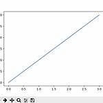
코드 1 import matplotlib.pyplot as plt plt.plot([1, 2, 3, 4]) plt.show() 결과 #실행 python src/Chart.py 기본 그래프 음.. 음.. 스타일지정 코드 2 import matplotlib.pyplot as plt #그리고 plt.plot([1, 2, 3, 4], [1, 4, 9, 16], 'ro') plt.axis([0, 6, 0, 20]) #보여준다 plt.show() 포맷 문자열 ‘ro’는 빨간색 (‘red’)의 원형 (‘o’) ‘b-‘는 파란색 (‘blue’)의 실선 (‘-‘) 정리가 필요하군.. matplotlib.pyplot 모듈의 axis() 함수를 이용해서 축의 범위 [xmin, xmax, ymin, ymax]를 지정 여러 개..
Python/matplotlib
2021. 12. 30. 10:25